Gousto
Role
As a Senior UX and UI Designer, I played a key role in leading Gousto's expansion into the Irish market. Additionally, I contributed to the development of the Design System in a consulting capacity to ensure consistency and scalability.
Who are they?
Gousto is a UK meal kit service delivering pre-portioned ingredients and recipes for easy home cooking.


Embracing challenge
Evolving requirements demanded flexibility in defining the rollout scope, while technical constraints and shifting timelines required continuous adaptation. Supply chain variability influenced decision-making, and rapid team growth highlighted the need for clear and efficient information sharing.
To navigate these complexities, we implemented a range of solutions, including version control and structured communication methods, fostering seamless collaboration and ensuring strong team alignment.

The project
Having previously collaborated with the Product Owner, we quickly established an efficient workflow. Our process centered around Jira—an unconventional choice for designers but one that provided structure and clarity. Given the temporary nature of my role, ensuring a smooth handover was a priority. To support this, we aligned ticket structures and tagging while also creating Confluence pages and Google Docs to document key information, bridge knowledge gaps, and enhance knowledge sharing across the team.
The initial UX discovery phase included competitor and market analysis, workshops, problem definition, and identifying key stakeholders while leveraging previous research and analytics. To navigate shifting priorities, I mapped out flows, counterflows, and designs, ensuring alignment with stakeholders and engineering. Testing was strategically timed, proceeding only once the team was confident the end-to-end flow was feasible within project timelines.


With rapid development timelines, UI designs often needed to be developer-ready on short notice. Some page templates were missing, while others had localized variations or were not yet integrated into the Design System. This created an opportunity to establish new UI page templates aligned with the Design System, enhancing consistency as the rollout scaled.
Additionally, I provided consultation on color streamlining and refined color token-naming conventions in the Design System, ensuring adherence to AA accessibility compliance. Wherever feasible, these improvements were implemented in the Minimal Marketable Product (MMP) to enhance both usability and accessibility from the outset.
With a tight deadline and a rapidly expanding dev team, I was the sole designer supporting multiple work streams. Staying ahead required meticulous planning, structured workshops, and proactive roadmap alignment—much like working in a fast-moving startup. A strong UX strategy was essential to maintaining data integrity and delivering a seamless experience. Cutting corners on UX could have led to misleading results, so I focused on defining the essential user flows while balancing stakeholder priorities, ensuring both usability and feasibility.

Login & Registration overview
Discovery and Design
The discovery and design phase of the Login and Registration bodyof work involved multiple rounds of UserTesting. We experimented with various login screen layouts, including tabbed, inline, and split-column designs, before determining the best direction.

Once we had clarity on the login experience, we shifted our focus to the registration flow, where a key pain point emerged—users were unaware of the benefits of signing up for a Club Eurostar loyalty account. Many assumed it was a paid subscription, which was the primary reason for opting out.

In our first round of testing,users frequently associated the loyalty program with pricing concerns,highlighting the need to clearlycommunicate that Club Eurostar is free to join. We adjusted the copyaccordingly, but in our second round oftesting, we found that users were still overlooking this information. The breakthrough came whenwe emphasized the word "FREE"in all caps, making it significantly more noticeable.


After refining the copy, we focused on layout optimizations. Users tended to skim over the benefits, especially during the checkout flow, where conversion is highly sensitive and time-critical. Through multiple rounds of testing, we experimented with different UI treatments while keeping the benefits messaging consistent.
Key User Insights
No matter how it was tested the feedback was the same - why would/should they choose to opt out of a free loyalty scheme. Participants expressed sentiments such as:
“Its not tedious to create a loyalty account and I like that it's free to join.”
"[I’m travelling anyway] I might as well get the loyalty scheme points..."
"Who would say no to savings and having discounts..."
"[Receiving loyalty points in your account] It's a little bonus perk"
While the solution seemed obvious, the challenge of opting users in automatically was more of a business decision than a UX issue.
After compiling pros, cons, and direct user feedback, we escalated the discussion to business, legal, and cross-functional teams. Following a series of reviews, we secured approval to automatically opt all users into Club Eurostar by default(except those under 16).
Outcome
- All new users are now automatically enrolled in Club Eurostar, ensuring they instantly benefit from the free rewards program.
- Clearly highlighting these perks provided users with a stronger sense of value, addressing previous misconceptions about it being a paid subscription.
- Additionally, removing the magic link from the registration flow significantly reduced friction across the site, particularly in checkout, where conversion is most sensitive.
Our list of deliverables was extensive, with tight timelines to meet. Within these constraints, my UX contributions included designing the Minimal Viable Product (MVP) and Minimal Marketable Product (MMP) to support a scalable rollout. I aligned Ireland’s UI designs with the UK while ensuring market localisation. Despite time and resource constraints, I implemented AA accessibility compliance wherever feasible. Additionally, I defined full end-to-end UI flows optimised for engineering development and delivered high-fidelity, user-validated designs, ensuring a seamless and effective user experience before handover.

A couple project overviews
With rapid development timelines, UI designs often needed to be developer-ready on short notice. Some page templates were missing, while others had localized variations or were not yet integrated into the Design System. This created an opportunity to establish new UI page templates aligned with the Design System, enhancing consistency as the rollout scaled.
Additionally, I provided consultation on color streamlining and refined color token-naming conventions in the Design System, ensuring adherence to AA accessibility compliance. Wherever feasible, these improvements were implemented in the Minimal Marketable Product (MMP) to enhance both usability and accessibility from the outset.
Enhancing Team Management Capabilities
Team Management allows users to add or remove team members, enabling them to book and manage their own travel using the company’s preferred payment method. Our key challenge:
How might we simplify adding team members for a smoother customer experience?


After helping refine the scope, I worked closely with the development team to explore feasible solutions within our tight deadlines.
To validate our approach, I facilitated 1:1 interviews with existing customers, gathering qualitative insights on our chosen prototypes. This was followed by multiple UserTesting rounds, ensuring we addressed user needs effectively.
With strong validation from testing, we confidently proceeded straight into development, meeting the project’s tight and shifting deadlines while maintaining a seamless user experience.
Beyond basic team management, we introduced the ability to upgrade or downgrade members to administrators—a feature shaped by insights from one-on-one customer interviews I facilitated. Through competitor analysis, stakeholder alignment, and multiple rounds of user testing, we delivered a solution that was both intuitive and valuable, streamlining business travel management.

Enhancing Payment Flexibility through collaboration
A key milestone in our work was integrating additional payment methods for Eurostar for Business, particularly for Travel Agencies. With the Thalys merger and expansion into new European markets, it became crucial to support different business tiers and payment preferences.
One major integration was Billie, which required seamless coordination between internal teams, DevOps, and third-party providers to ensure smooth incorporation within existing flows and technical constraints.
By collaborating closely with internal stakeholders and Billie’s team, we designed a UX solution that minimized disruption, provided a frictionless payment experience, and enhanced the user journey. To validate the approach, I conducted 1:1 customer interviews and multiple rounds of UserTesting, leading to key refinements before final implementation.
Once the UX was finalized, we shifted focus to UI enhancements and integrated necessary updates into the Design System, ensuring consistency across the platform.

Outcome
- All new users are now automatically enrolled in Club Eurostar, ensuring they instantly benefit from the free rewards program.
- Clearly highlighting these perks provided users with a stronger sense of value, addressing previous misconceptions about it being a paid subscription.
- Additionally, removing the magic link from the registration flow significantly reduced friction across the site, particularly in checkout, where conversion is most sensitive.
Our list of deliverables was extensive, with tight timelines to meet. Within these constraints, my UX contributions included designing the Minimal Viable Product (MVP) and Minimal Marketable Product (MMP) to support a scalable rollout. I aligned Ireland’s UI designs with the UK while ensuring market localisation. Despite time and resource constraints, I implemented AA accessibility compliance wherever feasible. Additionally, I defined full end-to-end UI flows optimised for engineering development and delivered high-fidelity, user-validated designs, ensuring a seamless and effective user experience before handover.
Outcome
Our list of deliverables was extensive, with tight timelines to meet. Within these constraints, my UX contributions included designing the Minimal Viable Product (MVP) and Minimal Marketable Product (MMP) to support a scalable rollout. I aligned Ireland’s UI designs with the UK while ensuring market localisation. Despite time and resource constraints, I implemented AA accessibility compliance wherever feasible. Additionally, I defined full end-to-end UI flows optimised for engineering development and delivered high-fidelity, user-validated designs, ensuring a seamless and effective user experience before handover.
One of the most rewarding aspects was facilitating brainstorming and workshop sessions alongside user research. Without access to a physical lab, we conducted remote sessions, which not only saved our busy business clients valuable time but also allowed key stakeholders to watch session recordings, ensuring alignment and deeper insights.

A lot was accomplished during this time, and I have distilled it down to three key contributions:
With rapid development timelines, UI designs often needed to be developer-ready on short notice. Some page templates were missing, while others had localized variations or were not yet integrated into the Design System. This created an opportunity to establish new UI page templates aligned with the Design System, enhancing consistency as the rollout scaled.
Additionally, I provided consultation on color streamlining and refined color token-naming conventions in the Design System, ensuring adherence to AA accessibility compliance. Wherever feasible, these improvements were implemented in the Minimal Marketable Product (MMP) to enhance both usability and accessibility from the outset.
- Redefined landing page templates across multiple levels—including Continent, Country, Region, County, City, Neighborhood, Landmark, Attraction, and specific attributes (e.g.,Pools)—leveraging both MVT (Multivariate Testing) and qualitative research.
- Optimized the Cookie Policy, implementingMVT-driven improvements to enhance user compliance and experience.
- Enhanced carousel cards by integrating customerreviews, creating a more engaging and informative user experience.
Modularize Attribute-Based Destination Landing Pages Sitewide by Region
The problem we faced
Site wide landing pages are not effectively optimized based on customer behaviour or location, resulting in lower conversion rates and higher bounce rates. By implementing more relevant, behaviour-driven landing pages, we aim to enhance engagement, improve user experience, and drive higher conversions while reducing bounce rates.
Landing pages covered multiple levels, including Continent, Country, Region, County, City, Neighbourhood, Landmark, Attraction, and specific attributes (e.g., Pools).
Our team structure
We assembled a dynamic team comprising a Junior Product Owner, the Head of Product, and the Lead UX, collaborating across multiple pillars—including landing pages.
My role was to define the North Star strategy for various landing page types across all regions and provide regular updates to the team on a weekly and bi-weekly basis.


The UI challenges
However, some existing modules were outdated, requiring both contextual and visual refinements. In certain cases, essential modules were missing entirely, necessitating ad-hoc creation or formal requests for inclusion in the Design System.Hotels.com was undergoing a secretive brand refresh, which expanded the scope of the project beyond optimising various landing pages and regions to also include updates to the Design System and overall branding. The modular design needed to incorporate insights from numerous previous test results while remaining flexible enough to support rapid iteration in future experiments.
My UX process
I began by conducting competitive audits to identify industry patterns and uncover opportunities for improvement.
Next, I carried out a comprehensive heuristic evaluation across all landing pages, which allowed me to establish a clear, modular information architecture tailored to different landing page types.


How the decisions were made
The Product Owner and I regularly facilitated workshops, whiteboarding sessions, and alignment meetings with stakeholders.
Through cross-team discussions, we uncovered valuable insights and communicated them to senior stakeholders, helping to inform and accelerate key business decisions.

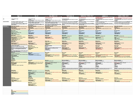
Given the vast amount of information, it was essential to present it in a clear, digestible format that could be easily shared and quickly understood.
To achieve this, all the information was distilled into a series of structured documents and design templates.
Outcome
After wireframing the information architecture, it was transformed into clear, concise documentation, ensuring seamless distribution across multiple teams.
Spreadsheets and diagrams served as central resources for collaboration, while tracking capabilities were enhanced across all pages.
Meanwhile, the UI was developed using existing components from the previous Design System, with new and improved components requested for integration into the upcoming Design System. This approach enabled a phased, strategic release across all breakpoints and platforms, covering Desktop, Tablet, Mobile Web, and the app.

Measurable results

visitor engagement

bounced visits

in qualified shoppers

through SRP, PDP, BF
Outcome
- All new users are now automatically enrolled in Club Eurostar, ensuring they instantly benefit from the free rewards program.
- Clearly highlighting these perks provided users with a stronger sense of value, addressing previous misconceptions about it being a paid subscription.
- Additionally, removing the magic link from the registration flow significantly reduced friction across the site, particularly in checkout, where conversion is most sensitive.
Our list of deliverables was extensive, with tight timelines to meet. Within these constraints, my UX contributions included designing the Minimal Viable Product (MVP) and Minimal Marketable Product (MMP) to support a scalable rollout. I aligned Ireland’s UI designs with the UK while ensuring market localisation. Despite time and resource constraints, I implemented AA accessibility compliance wherever feasible. Additionally, I defined full end-to-end UI flows optimised for engineering development and delivered high-fidelity, user-validated designs, ensuring a seamless and effective user experience before handover.
Outcome
Our list of deliverables was extensive, with tight timelines to meet. Within these constraints, my UX contributions included designing the Minimal Viable Product (MVP) and Minimal Marketable Product (MMP) to support a scalable rollout. I aligned Ireland’s UI designs with the UK while ensuring market localisation. Despite time and resource constraints, I implemented AA accessibility compliance wherever feasible. Additionally, I defined full end-to-end UI flows optimised for engineering development and delivered high-fidelity, user-validated designs, ensuring a seamless and effective user experience before handover.
One of the most rewarding aspects was facilitating brainstorming and workshop sessions alongside user research. Without access to a physical lab, we conducted remote sessions, which not only saved our busy business clients valuable time but also allowed key stakeholders to watch session recordings, ensuring alignment and deeper insights.
Outcome
Our list of deliverables was extensive, with tight timelines to meet. Within these constraints, my UX contributions included designing the Minimal Viable Product (MVP) and Minimal Marketable Product (MMP) to support a scalable rollout. I aligned Ireland’s UI designs with the UK while ensuring market localisation. Despite time and resource constraints, I implemented AA accessibility compliance wherever feasible. Additionally, I defined full end-to-end UI flows optimised for engineering development and delivered high-fidelity, user-validated designs, ensuring a seamless and effective user experience before handover.

